Klarna (usa)

Klarna is a Swedish fintech company that provides online financial services, including allowing users to make post-purchase payments. The company was looking to ramp up their marketing efforts in the US, since no one knew the brand.

As the graphic designer, my role was to support the needs of the Klarna USA Instagram pages. I was tasked with a few responsibilities which included

The Klarna brand is aspirational, quirky, sassy and fun. I had a great time designing for the page, as the needs constantly changed depending on the time of the year and the design goals.

  • Smooothest of The Week Stories: an online engagement opportunity meant to provide users with an opportunity to engage with the page, while being exposed to quirky, unique purchases that are unique to Klarna.

  • Merchant Round Up Stories: Weekly story sets meant to highlight either a specific Klarna merchant, or a themed collection of items available through Klarna merchants.

  • Good Looks of the Week Instagram Posts: A set of in-feed posts, in which Klarna users are hilighted and their outfits showcased.

  • Desire Series: A collaboration with high-profile designers and artists.

  • As well as other miscellaneous designs


SMOOOTHEST OF THE WEEK

Smooothest of the Week (SOTW) is a weekly series, where Klarna keeps a pulse on the latest trends and the interests of its users. After 6 months of testing and learning from the SOTW series, the team looked grow engagement even further by optimizing our series based on what we have seen our audience react to.

Results

The team saw its highest story completion rating and engagement stats in this new format.


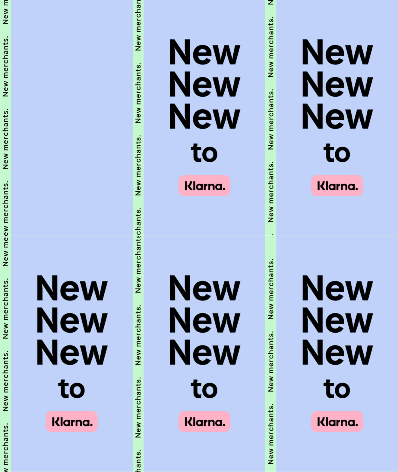
MERCHANT ROUNDUPS

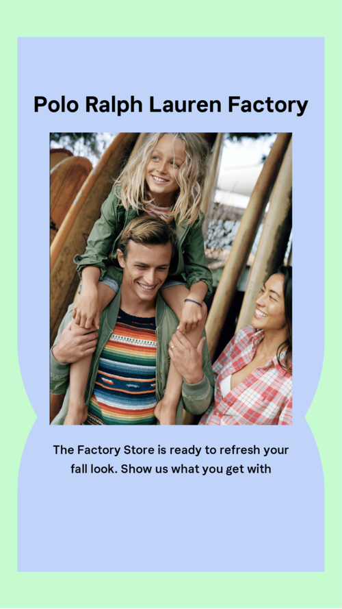
As mentioned above, MRUs are weekly story sets meant to highlight either a specific Klarna merchant, or a themed collection of items available through Klarna merchants. One of my first tasks after joining the Klarna team was to redesign the MRUs, as client was not a fan of the manner in which the branded shapes were worked into the original design (below).

That’s more like it.

I worked with the Art Director, and together we decided the best way to approach the redesign was to scale the designs down, and make them feel less editorial than the previous version. This included a rework of the introduction frame, in which the theme is better introduced, and users are told what to expect in the set of stories.

I also did away with the branded shapes, in favor of a bubble shape, where the client Instagram handles were to be inserted. The client was very happy with this new approach. We also saw an increase in story completion.


Plug in to tune out.

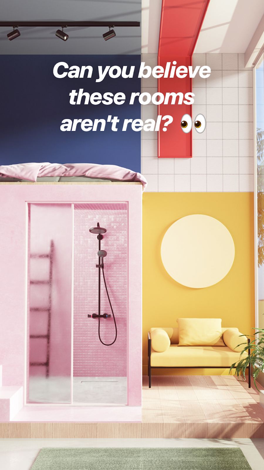
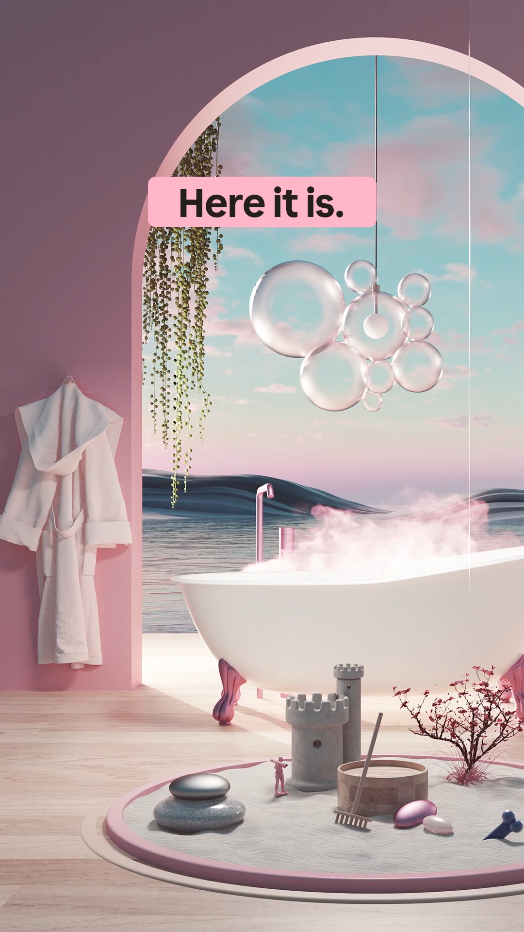
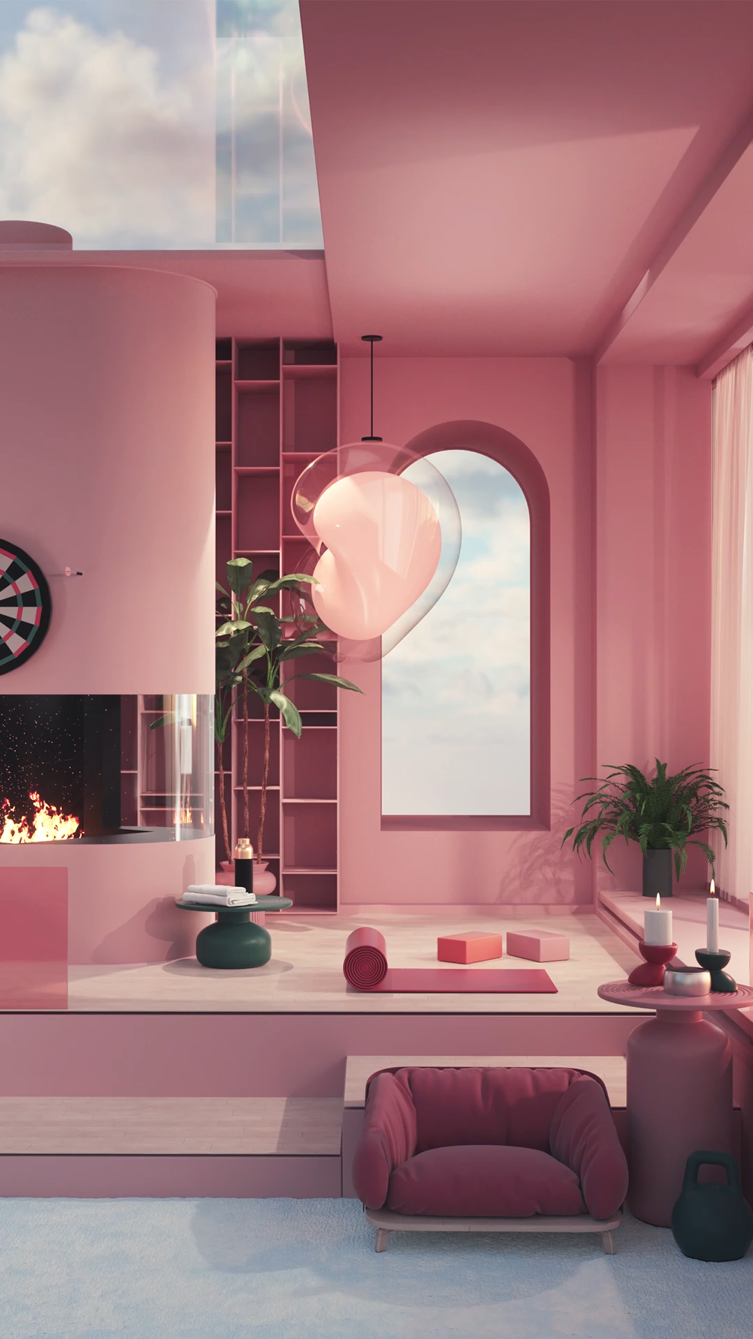
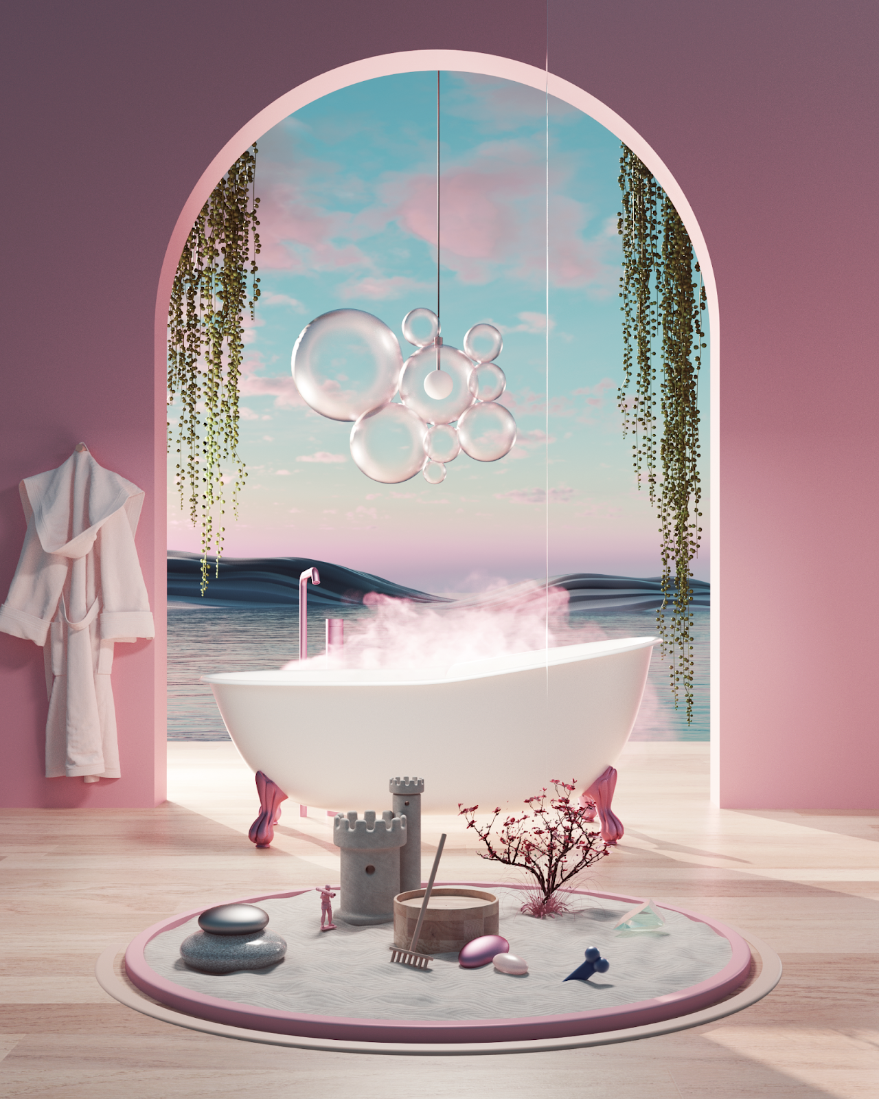
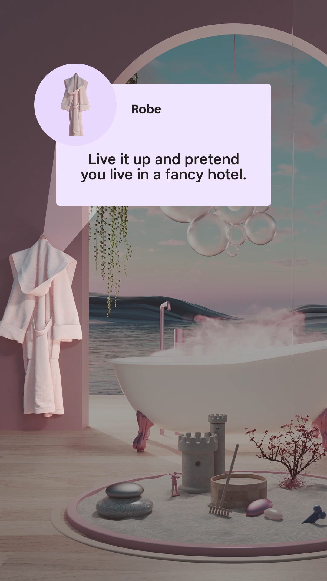
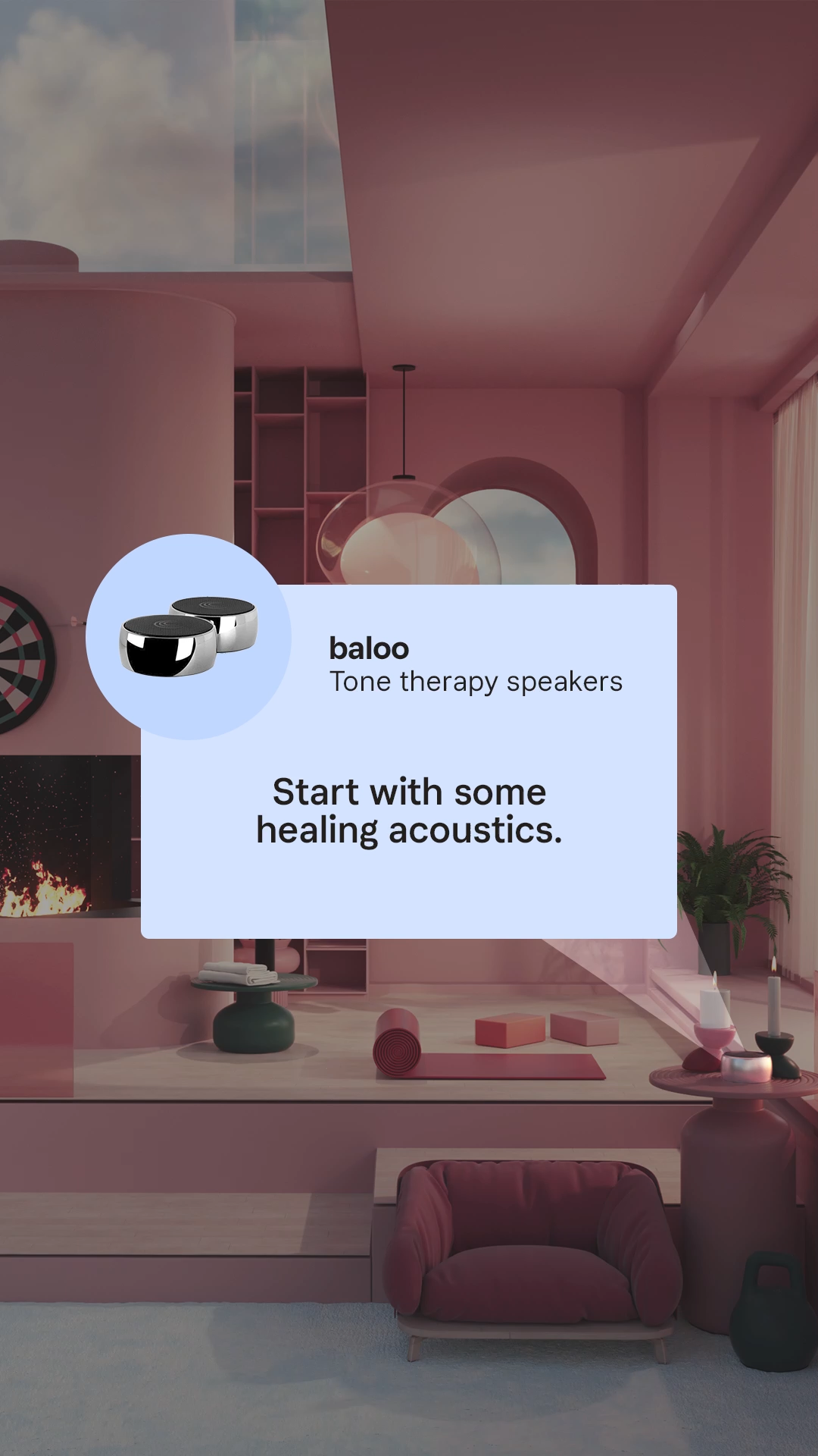
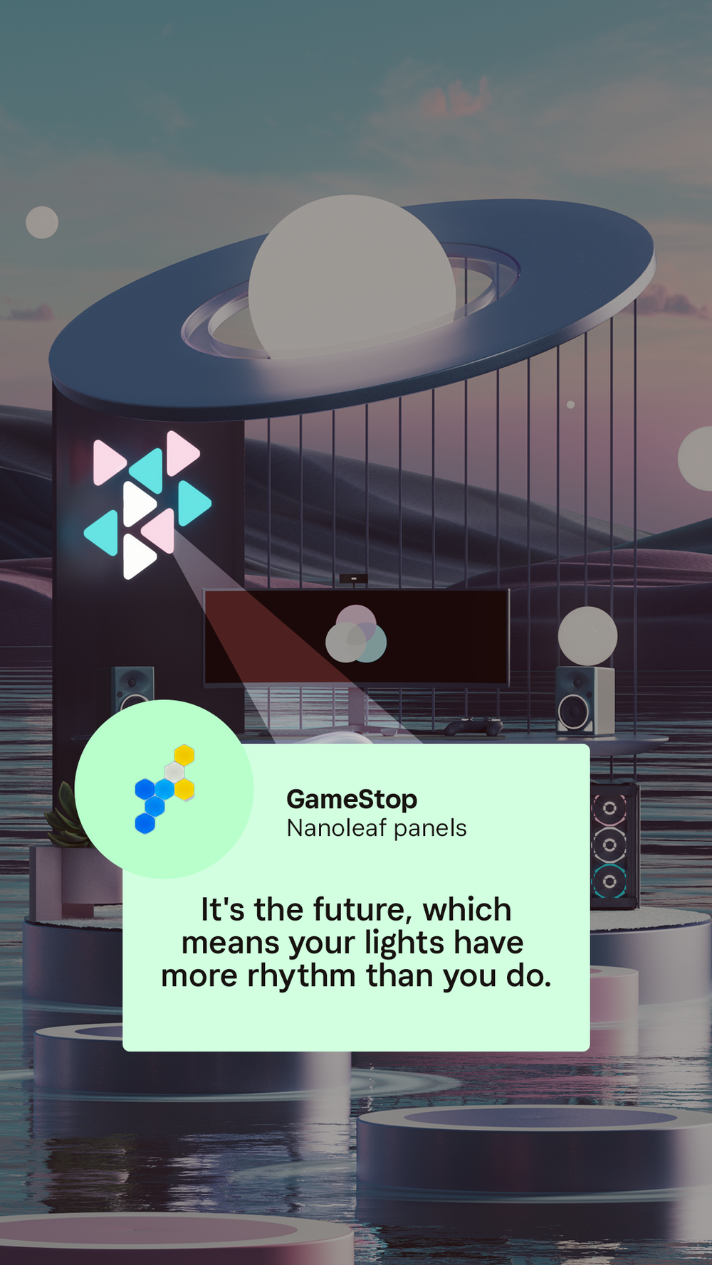
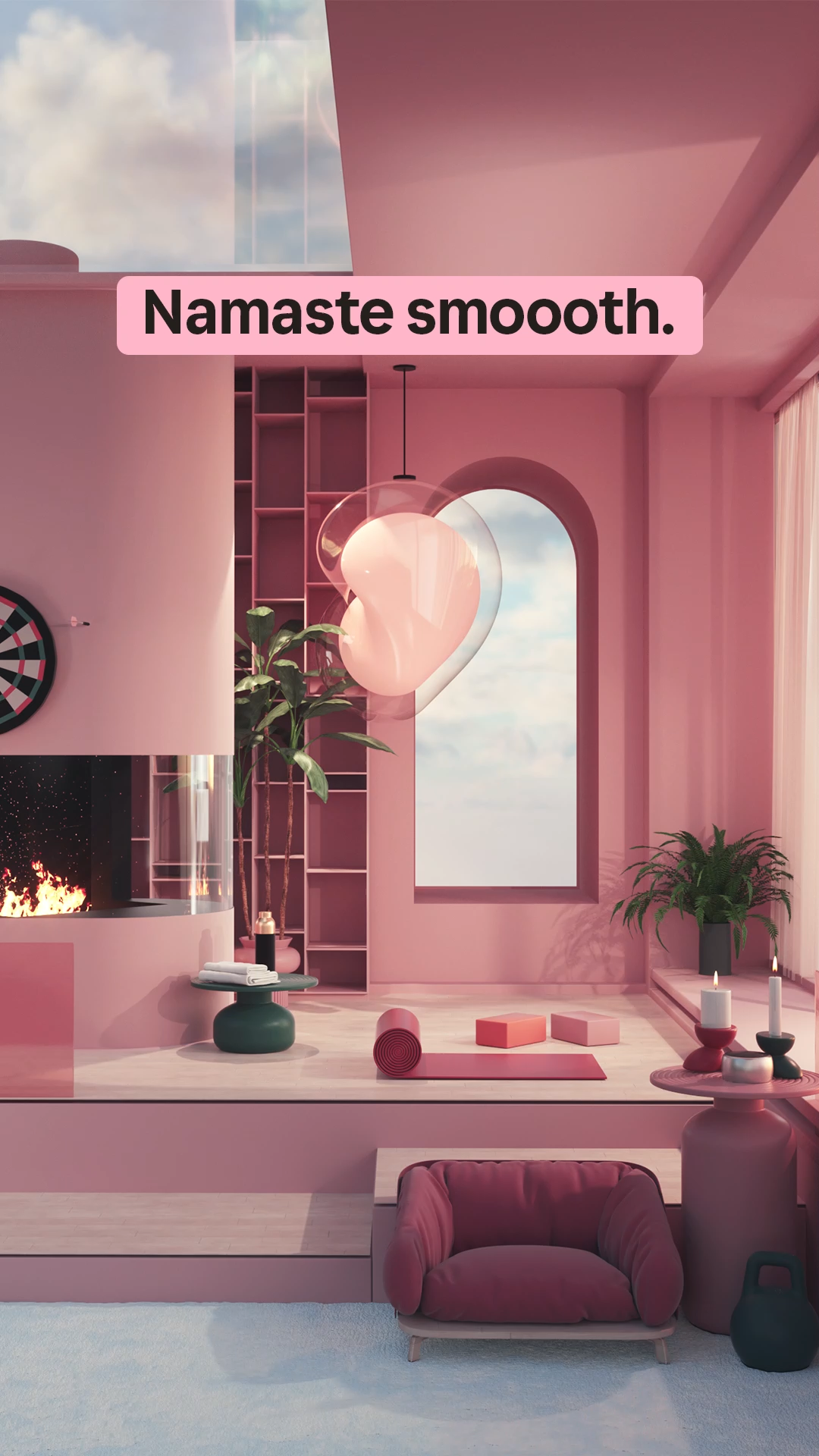
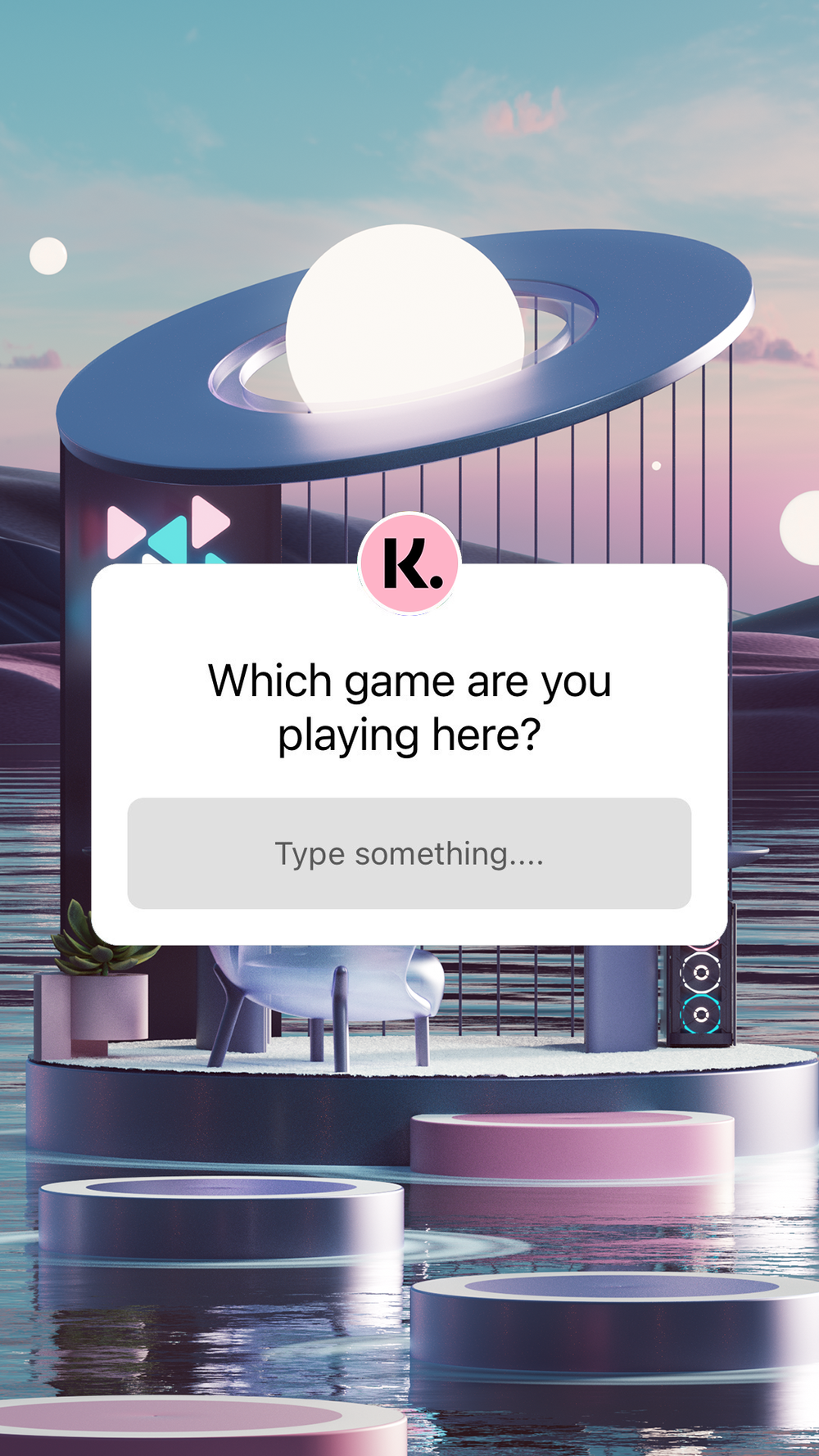
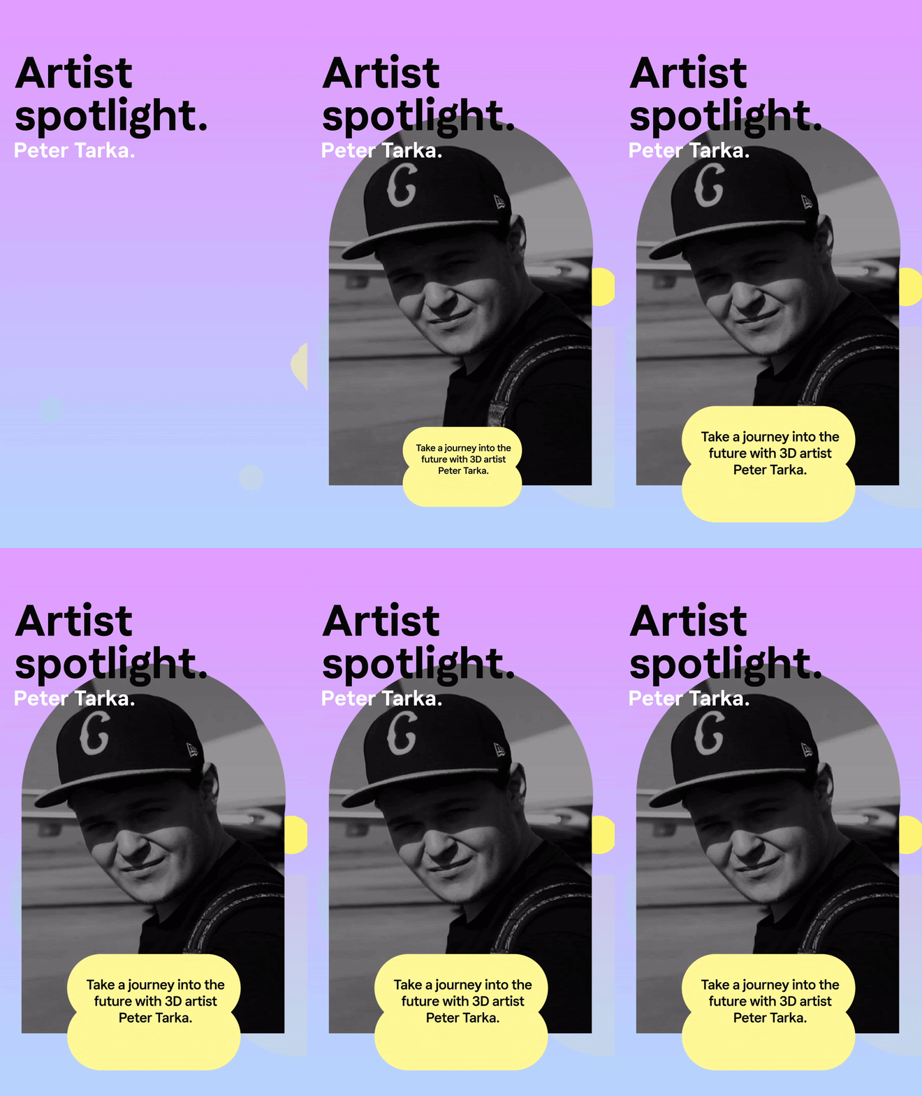
The Klarna team saw a natural fit with 3D artist, Peter Tarka. We reached out to him, and had him design 3 paradise spaces for us. Each room including objects that were available through Klarna.

Frame 1: each story opened with an animated frame, teasing the environmental space.

Frame 2 is a full bleed reveal of Peter Tarka’s artwork.

Frames 3 and 4 showcased objects that were available through Klarna.

The closing frame ended with an engagement sticker.


Good Looks of the Week

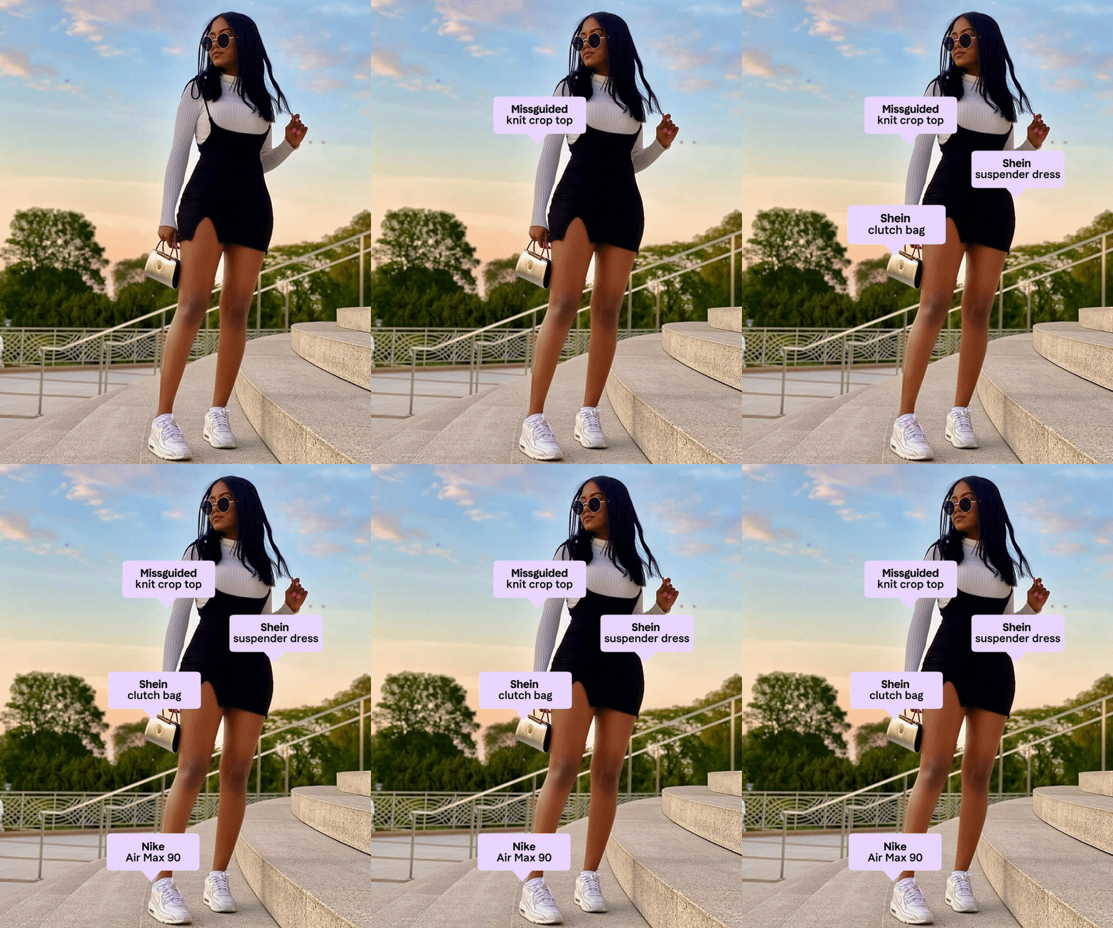
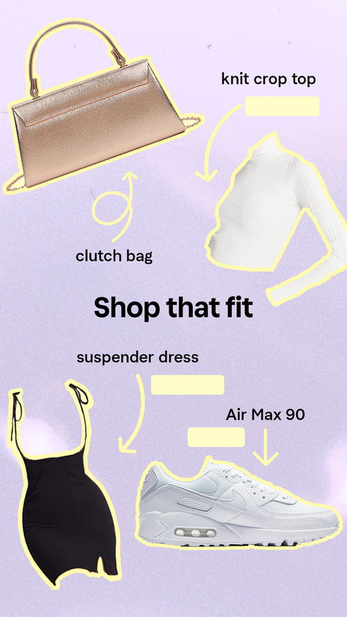
Klarna users are fashion-forward, so we wanted to spotlight them on Instagram. The purpose of GLOTW was to highlight stylish Klarna users and providing followers with the various pieces they would need to create a similar look.

This was also a redesign. The original version was just a repost of the user’s original photo. I was tasked with elevating it and taking it a bit further.

Additional miscellaneous work below.